Lightning Datatable example salesforce
Lightning Datatable example salesforce
In this blog post, I am going to explain how to use salesforce lightning:datatable component and its features. A lightning:datatable component displays tabular data where each column can be displayed based on the data type. lightning:datatable also supports inline editing. lightning:datatable is not supported on mobile devices.
Lightning Datatable Main Features
- Displaying and formatting of columns with appropriate data types
- Infinite scrolling of rows
- Inline editing for some data types
- Header-level actions
- Row-level actions
- Resizing of columns
- Selecting of rows
- Sorting of columns by ascending and descending order
- Text wrapping and clipping
- Row numbering column
- Cell content alignment
Tables can be populated during initialization using the data, columns, and keyField attributes. The keyField attribute is required for correct table behavior. It will associate each row with a unique identifier. The below code shows how to use the lightning: datatable to initialize the data and columns which are passed by using attributes.
Lightning Datatable Example
In this example, we will simply display list of account using lightning:datatable.
Apex class AccountController
public class AccountController{
    @AuraEnabled
    public static List <Account> fetchAccounts() {
        //Qyery 10 accounts
        List<Account> accList = [SELECT Id, Name, BillingState,
                                    Website, Phone, Industry, Type from Account LIMIT 10];
        //return list of accounts
        return accList;
    }
}
Lightning Component LightningDatatableExample
<aura:component controller="AccountController">

    <aura:attribute type="Account[]" name="acctList"/>
    <aura:attribute name="mycolumns" type="List"/>

    <aura:handler name="init" value="{!this}" action="{!c.fetchAcc}"/>

    <lightning:datatable data="{! v.acctList }"
                         columns="{! v.mycolumns }"
                         keyField="id"
                         hideCheckboxColumn="true"/>

</aura:component>
Lightning Component LightningDatatableExample Controller
({
    fetchAcc : function(component, event, helper) {
        helper.fetchAccHelper(component, event, helper);
    }
})
Lightning Component LightningDatatableExample Helper
({
	fetchAccHelper : function(component, event, helper) {
        component.set('v.mycolumns', [
            {label: 'Account Name', fieldName: 'Name', type: 'text'},
                {label: 'Industry', fieldName: 'Industry', type: 'text'},
                {label: 'Phone', fieldName: 'Phone', type: 'Phone'},
                {label: 'Website', fieldName: 'Website', type: 'url '}
            ]);
        var action = component.get("c.fetchAccounts");
        action.setParams({
        });
        action.setCallback(this, function(response){
            var state = response.getState();
            if (state === "SUCCESS") {
                component.set("v.acctList", response.getReturnValue());
            }
        });
        $A.enqueueAction(action);
    }
})
Lightning Application LightningDatatableExample
<aura:application extends="force:slds">
    <c:LightningDatatableExample/>
</aura:application>
Lightning Datatable example Output
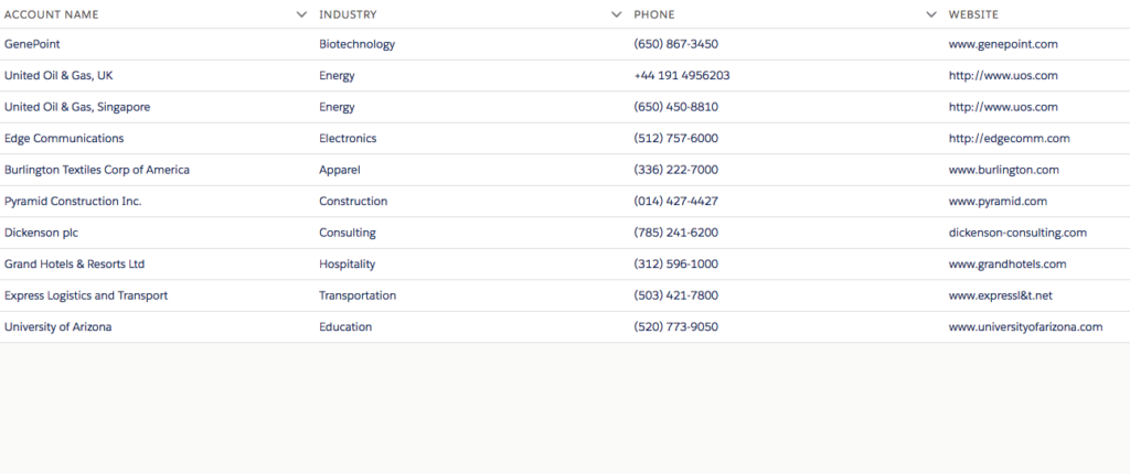
Lightning Datatable example salesforce output
Lightning Datatable Column Properties
Use the following column properties to customize the behavior and visual aspects of your columns.
| PROPERTY | TYPE | DESCRIPTION |
|---|---|---|
| actions | object | Appends a dropdown menu of actions to a column. You must pass in a list of label-name pairs. |
| cellAttributes | object | Provides additional customization, such as horizontal alignment or appending an icon to the output. For more information about alignment, see Aligning Data in a Column. For more information about adding icons, see Appending an Icon to Column Data. |
| editable | boolean | Specifies whether a column supports inline editing. The default is false. |
| fieldName | string | Required. The name that binds the columns properties to the associated data. Each columns property must correspond to an item in the data array. |
| fixedWidth | integer | Specifies the width of a column in pixels and makes the column non-resizable. |
| iconName | string | The Lightning Design System name of the icon. Names are written in the format standard:opportunity. The icon is appended to the left of the header label. |
| initialWidth | integer | The width of the column when it's initialized, which must be within the minColumnWidth and maxColumnWidth values, or within 50px and 1000px if they are not provided. |
| label | string | Required. The text label displayed in the column header. |
| sortable | boolean | Specifies whether the column can be sorted. The default is false. |
| type | string | Required. The data type to be used for data formatting. For more information, see Formatting with Data Types. |
| typeAttributes | object | Provides custom formatting with component attributes for the data type. For example, currencyCode for the currency type. For more information, see Formatting with Data Types. |
For more details please refer below official link lightning datatable
Happy Coding 🙂
The post Lightning Datatable example salesforce appeared first on Salesforce Blog.